You have probably noticed in the digital world that imagery is now much more prominent and wordy websites are falling out of favour. Visual language is always evolving and is as important a communication tool as text.
Your business needs to communicate in an instant something of what your business is about (your sector) and then be memorable, so customers are never in any doubt that they are looking at the business they know and/or trust whatever platform they find you on (unique).
Think of this concept as finding the right visual vibe for your business, then using the same look consistently across your various platforms (website, social media and print). Breaking it down into practical terms it includes your logo, colour palette, style of imagery, fonts and layout. There is no doubt that visual impact is essential for a business and understanding the visual language is key to having design that reflects your business specifically – and the sector the business is in. Would you trust a bank that had the colours, fonts and style of a pizza parlour?
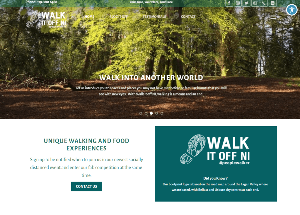
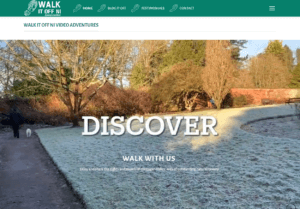
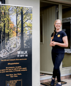
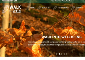
One of my recent favourites is a logo design we made for @walkitoffni – we wanted to reflect the outdoors and action of her business and something of the geography as it is rooted in the Lagan Valley – together we came up with the Bootprint logo, the tread in the Walk it Off NI logo is a map of routes between Lisburn and Belfast. It is a strong design now throughout her online and offline presence and we built her website around the imagery rooted in the boots on the ground, trying where possible to visually reflect journeys or paths. The colour palette, particularly on the website was chosen to reflect the outdoor nature of the venture in blues and greens but we shifted the colour palette towards a modern dynamic aesthetic with pops of vibrant yellows and pinks provided by Nikkis fantastic nature photography.
If you feel you are across this visual language for your business, there are tools to help you reflect this available online and I will cover some of my favourites over the next few weeks. My first tip is Google – search your type of business and add the word logo for example in google and then use the image tab – you will see an overview of colour palettes and fonts worldwide that your competition are using – this lets you understand how your sector identifies itself in visual language. I also suggest doing the same in Vistaprint. They have a vast range of templates and can give you inspiration and a starting point to make your own distinct look.
Of course I would say that a good designer can help you come up with your distinctive visual presence and can help by seeing your business from the outside which can be challenging for business owners enmeshed in the day to day running of their empire.
