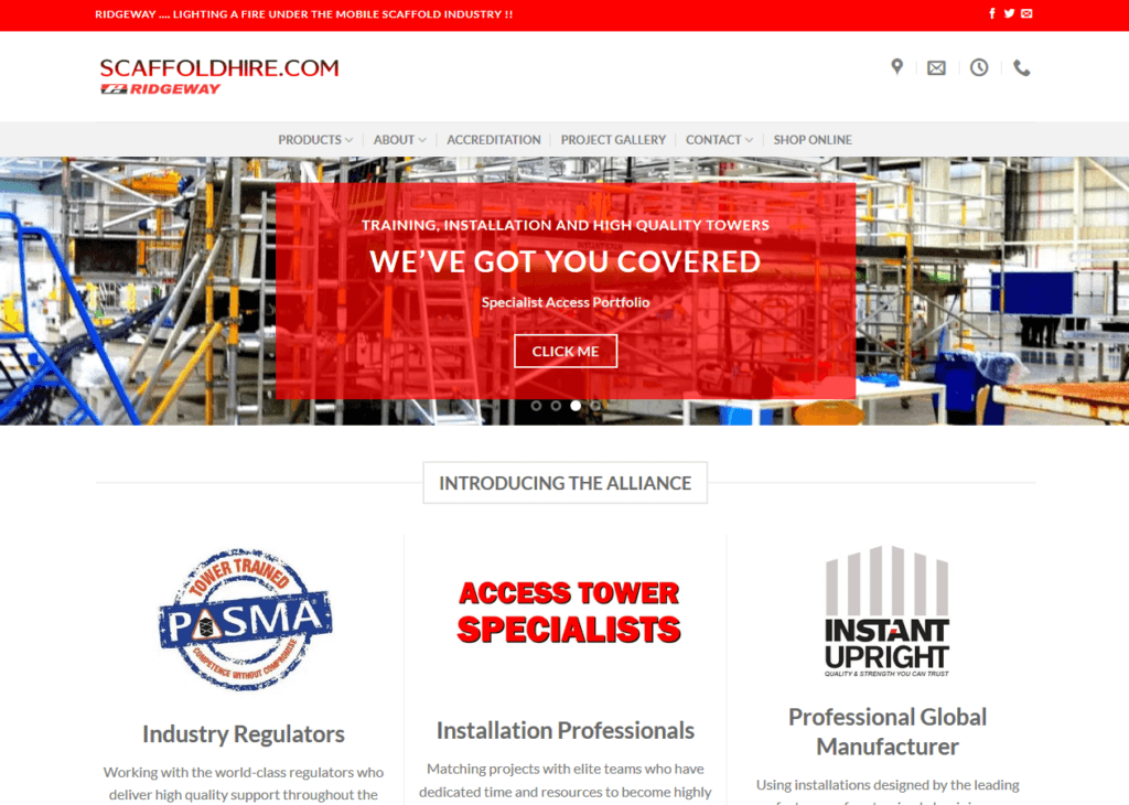
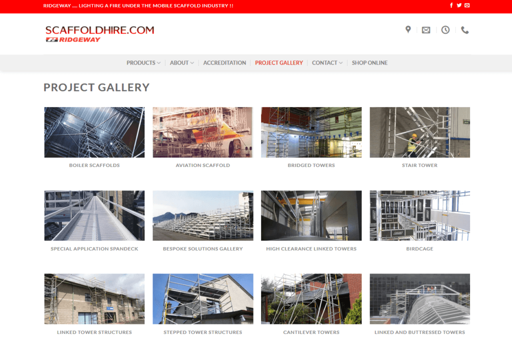
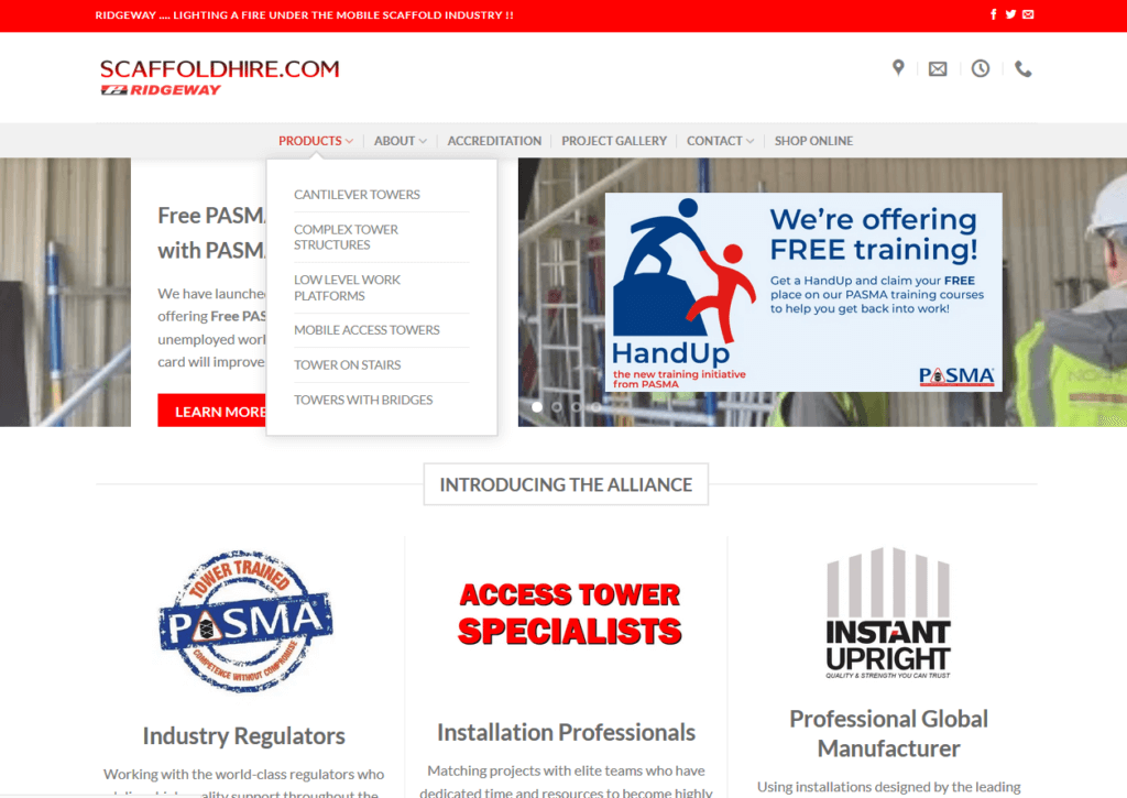
A recent redesign of the menu structure for Scaffoldhire.com provided the client with a fresh way to showcase their products. We re-arranged the navigation to put both products and real-life projects front and centre. This gives customers two different ways to learn about what’s on offer. They can find detailed product information at a glance, and see items in action in an applications gallery. This flexibility to refresh the structure and navigation is something we build into the design from the start. So you can update your online shop window as and when you wish!


