A well-chosen colour palette is a selection of just a few colours that combine beautifully and create a sense of harmony. If you can settle on a great colour palette and use it consistently, it will not only be aesthetically pleasing but will strengthen your brand recognition. It should also express something about your business. Calming greens, strong reds or classic neutrals each suggest something without us necessarily being conscious of the effect. Blue in its various shades is enduringly popular in the corporate and educational worlds.
Colour palettes are interesting and complex to get right. As a designer I have a number of ways of choosing colour palettes, initially as I mentioned yesterday looking at the business sector’s visual language – what does the clients competition use as their signature colours and what does that say to their customers. Then there is the aesthetic of the client – sometimes that can be difficult to communicate, often the clients will know what they don’t like which ends up with a lot of ‘do it again’ moments. So one of my communication tools is a winning wheeze called Coolors Collage Maker I ask my clients for images or designs that speak to them or inspire them in the way that they would like their visual language to inspire others.
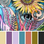
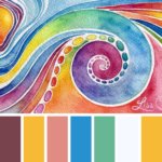
I then use coolors.co to create a colour palette based on their choices and use the created palette as a starting point for the colours in the designs we create for them. I’ve uploaded a couple for you to see what I mean.
Or check out this project story on our website. Once you know, you can see it’s exactly how the colour palette for this digital flyer for Mark Graham was developed but it gives the warm earthy feel that was very appropriate.
My second go-to for choosing colours is a rather nifty infographic I have which helps pare down the colour choices by simply explaining some basic colour theories. You can download it here.
Less is almost always more when it comes to colour and a choice of 3 or 4 in the right hues, preferably complementing your company logo is all that is needed to tie things together.
If you have colour questions I can help with do drop me a message.
